Giving hydration a more premium expression
Position Hydra Shine as a premium haircare solution through a more sophisticated and benefit-led packaging experience.
The launch of Hydra Shine required a stronger premium expression while remaining faithful to Weleda’s evolving identity.
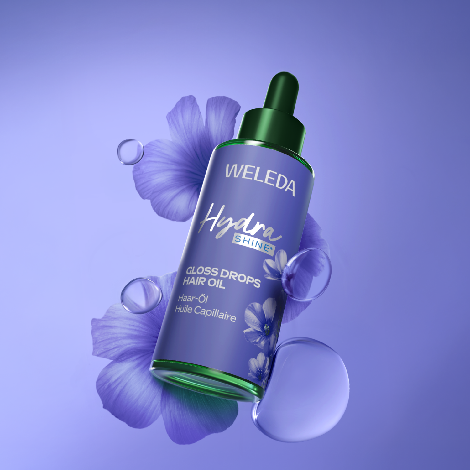
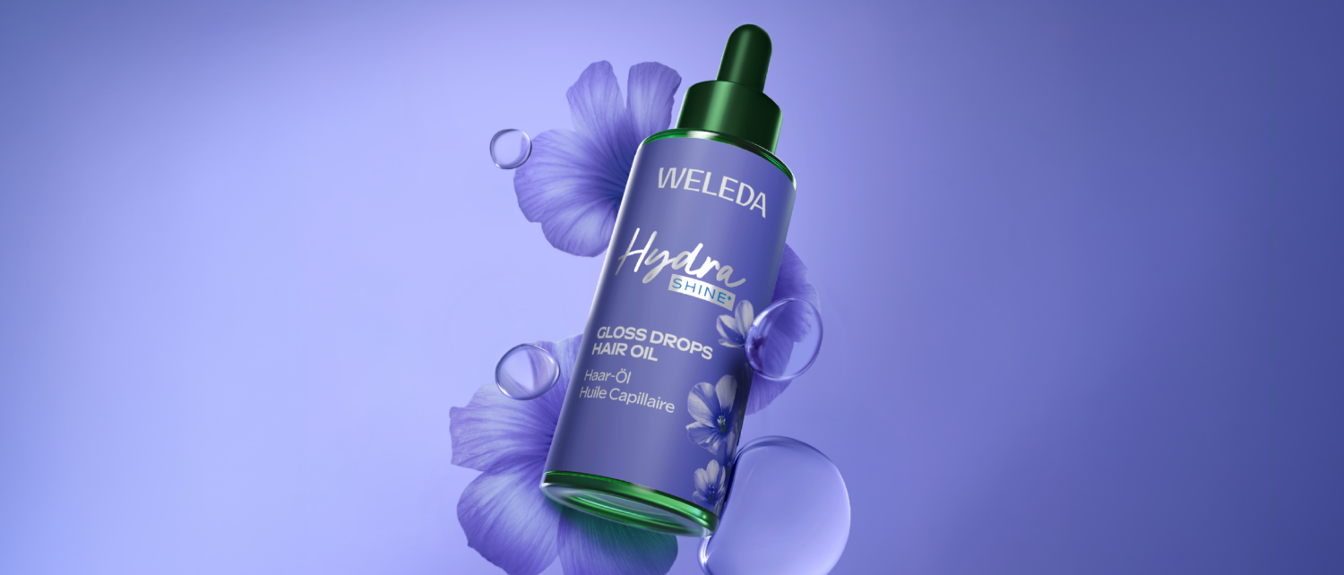
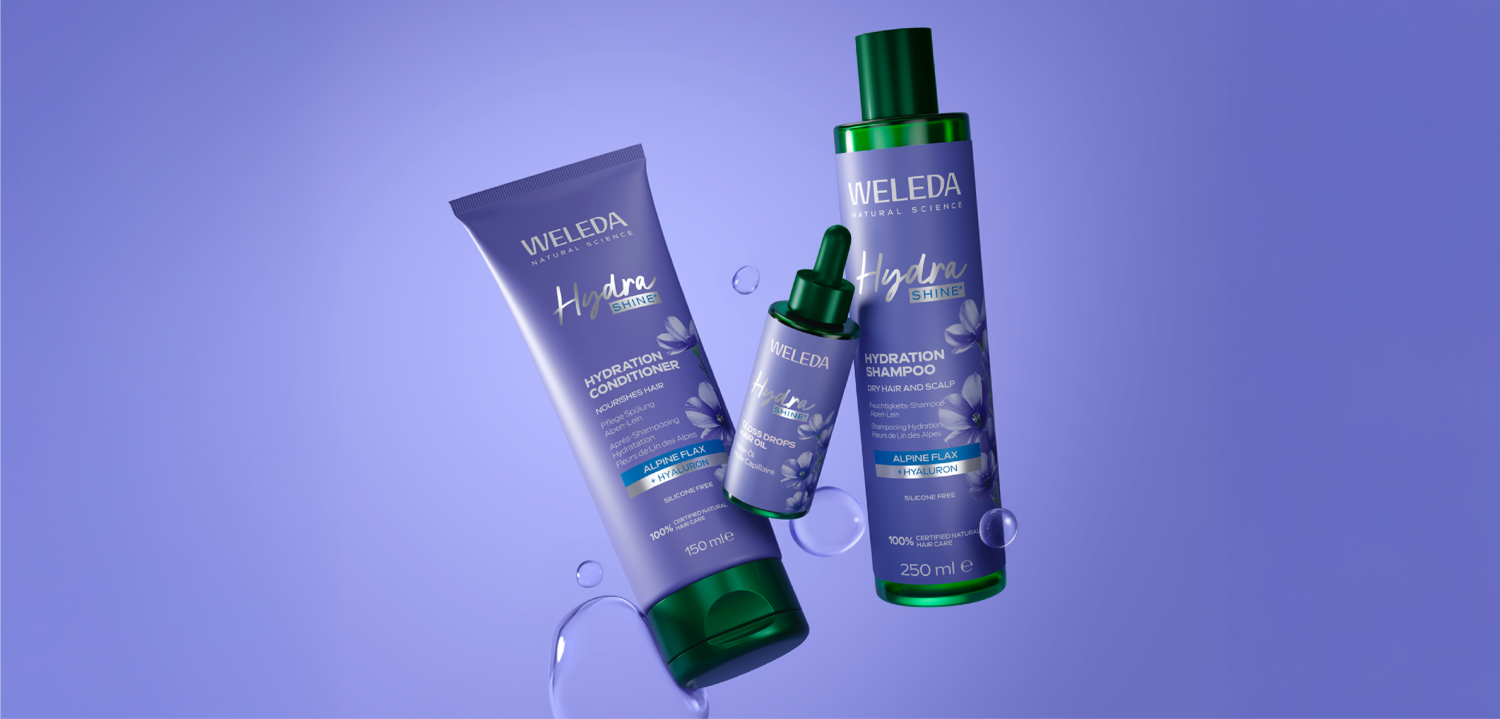
Crépuscule developed a luminous design territory combining botanical illustrations, elegant colour harmonies and a simplified information hierarchy. Ingredient communication and product benefits were carefully orchestrated to express both scientific performance and natural beauty.
A more desirable packaging architecture that strengthens premium perception, improves benefit clarity and reinforces shelf differentiation.